My first time speaking professionally in public was back in 2005 at the first An Event Apart in Philadelphia. While not my first time speaking in front of a big audience, it was the first time I had to prepare a slide deck and use Keynote.
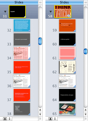
Before and after view of a slide deck. On the left, you can see the bright red used to slides that need work, as well as black and grey for title slides, and blue for quotations.
Two basic rules: simple and big

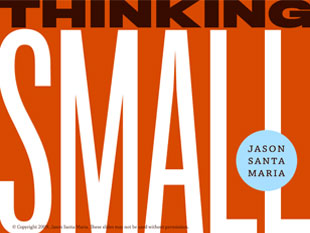
When I use images, I almost always use them full screen and free of distraction.
Keep your title slides to a few words, then speak through the rest of the story.
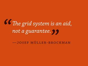
A sample quotation slide.
Understandably, I was nervous, so beforehand, I had scribed lots of notes to guide me as I was speaking. On the big day, I used Keynote’s “presenter mode” which allows the presenter to see their notes while the audience sees the normal slides. A few slides in, I realized my grave mistake: I had entirely too many notes than would fit on my small screen, and no way to access the hidden ones. I was lost.
I didn’t completely bomb, but I wasn’t great either. The mishap threw me off and made my delivery dry and hurried. I had spent so much time writing the talk, I hadn’t even thought about what I wanted to say. I was onstage without a point—or one that I was aware of without my notes.
At that point, I realized that I couldn’t let technology do the talking. Maybe it was watching people like Jeffrey or Eric, whose presentation styles are loose and conversational, but I realized that if I had any hope of injecting a bit of myself into a talk, I would have to get the information into my head rather than on my screen.
Since then I’ve done a good bit of public speaking, and I’ve never given a talk that way again. I’ve collected some pointers below that help me prepare on what I want to say, but I give no assurances. These are things that work for me; what works for you might be completely different. Public speaking, especially good public speaking, is tough as hell, and I don’t claim to be an expert.
Your Slides Are Not Your Talk
Even though slides are what most people equate with “the talk,” depending on your presentation style, they are actually one of the least important aspects.
Focus on what you want to say. I start out by making outlines in a notebook and flagging things I know I have information on, or things I need to research further. If you’ve read anything I’ve written over the years, you’ll probably see this process is similar to how I do many things, building with small steps and not worrying about the final product too early.
I try to find a story whenever possible, or at least try to give a talk a natural arc. Collections of assorted tips and tricks can be great if you’re that kind of speaker, but I’ve found this doesn’t work as well for me. Most times I like posing an argument then supporting and building on it over the course of a talk.
So how do you find your arc? Focus on the message that you’re trying to convey and make sure all your points support it. That, and don’t worry about the design of your slides until it’s time to start worrying. When I start working things up in Keynote, I use just three colors for slides. Black for titles, grey for secondary titles, and blue for quotations (if any). I transfer my outline into Keynote and build a structure around those three colors. When I hit an unknown slide, where I know something should go but I don’t know what that something is yet, I drag a red swatch from the color palette onto that slide to change the background to bright red. I can go back later and see where the problem areas are at a glance. (This is not dissimilar to Cory Doctorow’s tip for inserting “TK” when writing.)
Working this way allows me to build and write a talk in stepped approach. I introduce a limited number of slide types to help me reign in my thoughts and stay focused. I go through the deck in multiple passes, adding more detail and refinement each time until the story really starts to take shape. Only then do I start to worry about the actual design of the slides.
Don’t Be Small
I have two basic rules for slide design: simple and big. Type should always be big enough to read from the back of the room, and simplicity is best to convey information quickly. For instance, when I use imagery, I only use images that take up the full slide. And usually without any text. Just a simple big picture and then I fill in the rest of the story during the talk. I generally lean towards having lots of slides because I like having lots of examples or alternate ways of presenting information.
Throw Yourself A Line
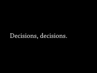
I often think of a slide as the little graphics superimposed next to a news anchor’s head on TV. There is just enough space to convey a starting point to a thought, not always the thought itself. It’s your job as the presenter to deliver the story. I often employ short titles and phrases of one or two words and talk around that thought. This not only has the advantage of forcing you to turn your attention to the audience instead of worrying about what your slide says, but it also makes the presentation more special. You, the speaker, not the slides, are conveying the information. This isn’t something that can just be read and your presence inconsequential.
I never memorize what I want to say. Instead, I rehearse so that I know the concepts I’m trying to convey. The slides serve as my mental triggers: I see the title of the slide and it makes me remember the important parts of the idea I want to discuss. Then I just talk through the key points, which has the added benefit of bringing about a natural improvisation during the presentation, and hopefully, helps me act a bit more naturally. I never use presenter notes or the presenter display mode anymore, I see exactly what the audience sees.
Reading Can Be Deadly
You are not invisible up in front of everyone, so merely reading bullet points off a slide that anyone in the audience can clearly read themselves is not enough. Your mood, body language, and delivery all affect the message. The presentation is just as much about you as the material you’re presenting.


 Letter By Letter
 Follow me on Twitter
35 Comments